

El Gabry Developments
El Gabry Developments needed a website that could do more than display properties. Monarq built a polished real estate platform that guides users through the brand, projects, values, and conversion paths with clarity and confidence.


Case Study
El Gabry Developments needed a website that could do more than display properties. Monarq built a polished real estate platform that guides users through the brand, projects, values, and conversion paths with clarity and confidence.
El Gabry Developments is a high-end real estate developer with a portfolio rooted in lifestyle, comfort, and long-term value. The website needed to become more than a place where projects are listed. It needed to act as the first emotional step in a buyer journey, because in real estate the decision often begins long before a phone call or site visit. A user has to feel trust, orientation, aspiration, and confidence within the first few moments.
Client Context
The brand operates in a category where buyers are evaluating both a property and a future way of living. This means the digital platform had to communicate more than specifications. It had to reflect stability, taste, quality, and a sense of arrival. El Gabry Developments already had the substance behind the brand. The role of the website was to organize that substance into a journey that feels clear and premium.
The Strategic Challenge
Many real estate websites collapse under the weight of their own content. They overload visitors with project names, technical data, galleries, forms, and aggressive calls to action. That creates friction at the exact moment where trust should be forming. For El Gabry, the challenge was to create a platform that could feel visually rich without becoming heavy, informative without becoming exhausting, and conversion-focused without feeling pushy.
Audience and Intent
The audience is not only browsing units. They are comparing developers, imagining future routines, evaluating credibility, and deciding whether a project deserves deeper attention. Some users arrive with a specific compound in mind. Others arrive only with curiosity about the developer. The experience had to serve both behaviors without splitting the site into disconnected paths.
Experience Strategy
Monarq approached the site as a guided decision journey. The homepage introduces the brand, sets an emotional tone, and gradually moves users into project discovery. Instead of treating every section as equal, the experience prioritizes what a buyer needs to understand first. The user is not forced to decode the brand. The structure does that work quietly through pacing, hierarchy, and interaction.
Brand Storytelling
The storytelling needed to be confident without becoming abstract. Real estate brands can easily drift into generic lifestyle language, so the content rhythm was shaped around concrete reassurance: who the developer is, what kind of communities it builds, how projects are positioned, and what makes the portfolio worth exploring. The copy supports aspiration, but it also keeps the user grounded.
Design Direction
The visual direction is calm, elegant, and residential. Spacing is used as a sign of confidence. Imagery is given room to breathe. Typography and layout choices avoid noise so the experience can feel established rather than decorative. The goal was not to impress through excess, but to create a feeling of clarity and comfort. This matters because the brand is ultimately selling environments people imagine themselves living in.
Project Discovery
The project structure was designed to make exploration easier. Developments are organized in a way that prevents the portfolio from becoming a long static list. Content is revealed progressively, allowing users to move from overview to detail when their interest is ready. This reduces cognitive load and gives each project a stronger presence.
Information Architecture
The information architecture separates brand-level confidence from project-level decision-making. Users can understand El Gabry first, then move into individual developments with a clearer frame of reference. This prevents project pages from carrying the full burden of explaining the company. It also makes future project expansion easier, because new developments can be added into a system that already has a strong hierarchy.
Interaction Design
Interactions are used to support attention rather than distract from the journey. Hover-based reveals, collapsible moments, and scroll-led transitions allow the site to hold a large amount of information without showing everything at once. For unit and project information, this is especially important. Users can stay visually oriented while still accessing the depth they need.
Conversion Thinking
The conversion strategy is intentionally restrained. Calls to action appear as natural next steps rather than interruptions. The user is guided toward contact after enough trust has been established. This creates a more respectful journey and reduces the feeling of pressure, which is critical in a high-consideration category like real estate.
Mobile Experience
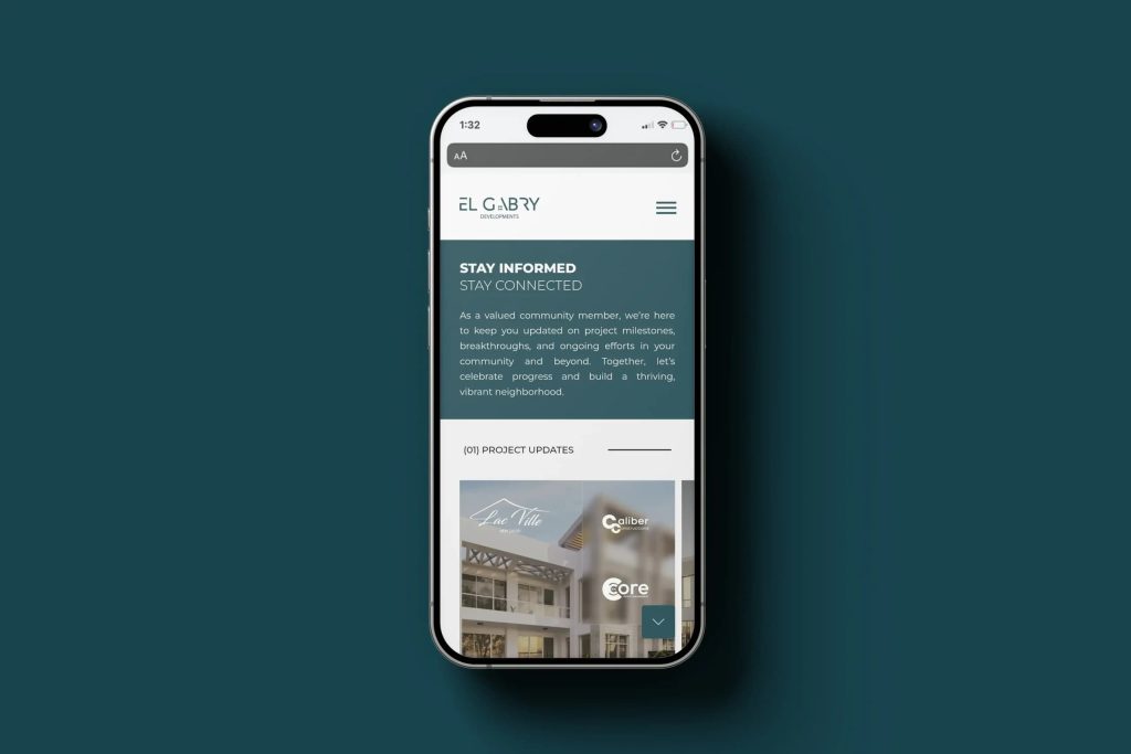
Mobile was not treated as a compressed desktop version. Layouts stack with breathing room, project exploration becomes more direct, and actions are placed where they are easier to reach. The mobile experience keeps the same premium tone while respecting the practical behavior of users browsing from smaller screens.
Technical Foundation
The platform was structured to grow beyond the immediate website. Real estate brands often need to expand into resident services, facility management, maintenance requests, clubhouse reservations, gated access, or project-specific portals. The site was built with that future in mind, so the digital presence can evolve without losing its core architecture.
Operational Value
Beyond the public interface, the site gives the brand a more controlled way to maintain its digital portfolio. Project information can be updated with consistency, visual assets can be presented with stronger structure, and enquiries can be directed through clearer touchpoints. This turns the website into an operational asset rather than a static brochure.
Client and Market Position
El Gabry Developments is not selling a quick online transaction. It is selling belief in a future address, confidence in a developer, and the emotional security that comes with choosing the right community. The website therefore had to respect the weight of the decision. It needed to present the client as established, considered, and capable of delivering a lifestyle promise over time.
Buyer Psychology
Real estate buyers move through a layered emotional process. They want aspiration, but they also want proof. They want to imagine a better life, but they need to feel that the developer is dependable. The digital journey was shaped around that tension. It gives users atmosphere first, then structure, then details, then enquiry. This mirrors the way a serious buyer becomes comfortable with a high-value decision.
Trust Signals
Trust is created through many small cues: controlled typography, steady pacing, clear project hierarchy, readable content, restrained calls to action, and confident image placement. The website avoids desperate selling because premium real estate needs composure. Every section is designed to tell the user that the brand knows what it is doing and does not need to overwhelm them to be convincing.
Business Perspective
From the client side, the platform needed to support brand perception, project education, and lead generation at the same time. It gives the business a polished public face while also creating a more structured path for enquiries. The site becomes a sales support system, a credibility tool, and a foundation for future digital services.
Competitive Context
Real estate developers compete in an environment where many websites look similar: large renders, project cards, and contact forms. The opportunity for El Gabry was to create stronger perceived maturity. The website needed to feel like a developer with a point of view, not just another portfolio of compounds.
Content and SEO Thinking
The content structure supports search and user comprehension at the same time. Brand sections, project sections, location-led language, and lifestyle-oriented copy give the platform more semantic depth. This helps users understand the offer while giving the site a stronger foundation for long-term discoverability.
Performance and Attention
Because real estate relies heavily on imagery, performance had to be considered carefully. The experience needed rich visuals without making the site feel slow or fragile. The design balances image presence with controlled layouts so users can stay emotionally engaged without waiting through heavy pages.
Measurement and Learning
The platform creates clearer paths for understanding interest. Project exploration, enquiry points, and content engagement can become signals for the client. Over time, those signals can help the business understand what users care about most and where future content or campaign effort should be focused.
Outcome
The final platform positions El Gabry Developments with a digital experience that feels premium, trustworthy, and future-ready. It does not simply show properties. It creates a sense of confidence around the brand and gives users a clear path from discovery to enquiry. The website becomes a foundation for a larger ecosystem, not a temporary brochure.