
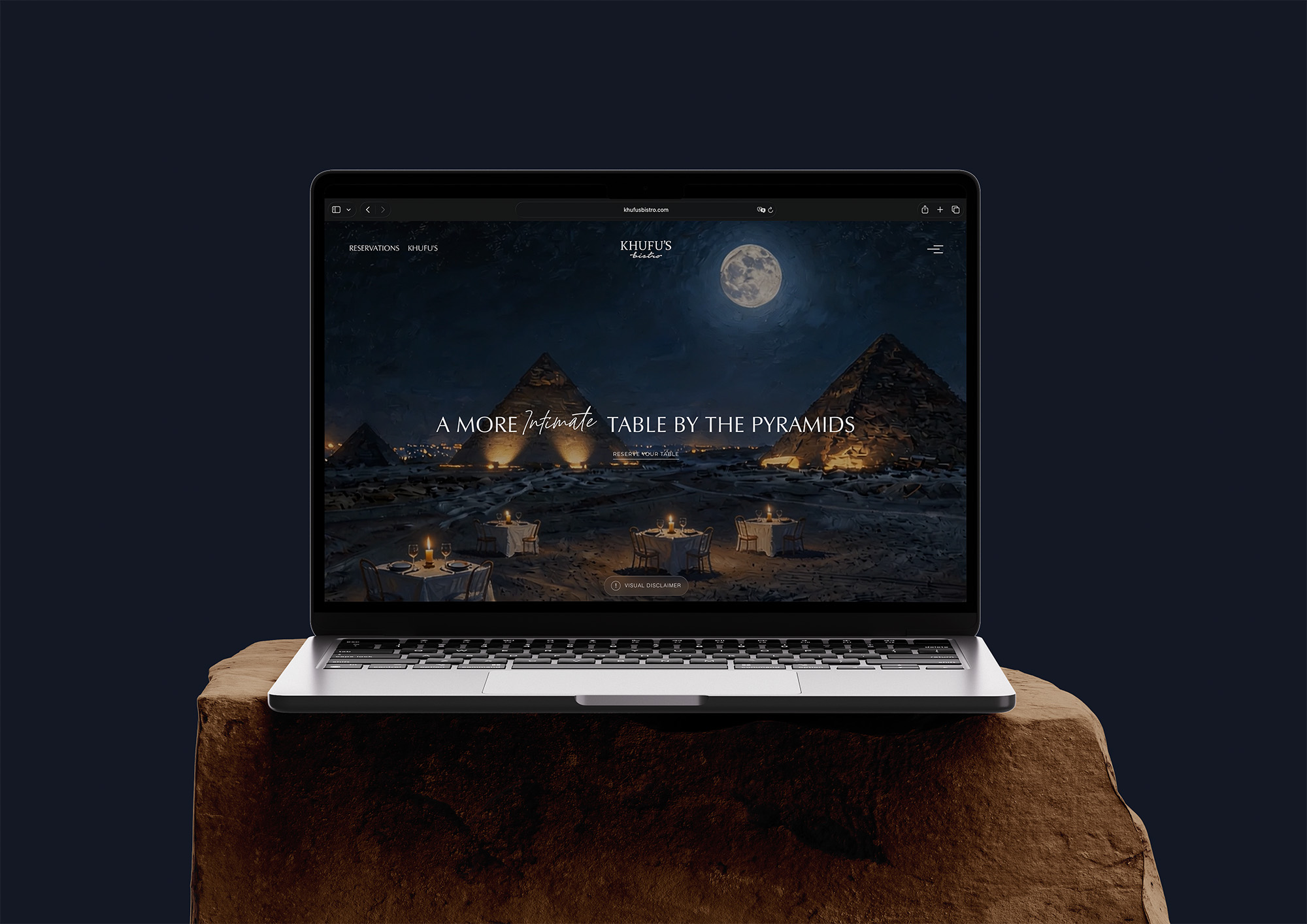
Khufu’s Bistro – After Dark
A museum-like nighttime experience curating mood, food, people, and AI-generated art, supported by a separate photographic menu and external reservations.
Case Study
A museum-like nighttime experience curating mood, food, people, and AI-generated art, supported by a separate photographic menu and external reservations.
Khufu’s Bistro belongs to the same world as KHUFU’S, but it represents a different hour, rhythm, and emotional state. As daylight leaves the Giza Plateau, attention moves away from the monument as the sole subject and toward the complete atmosphere of the evening: candlelight, stone, open air, food, conversation, art, and the slower pace of an elevated nighttime table. The digital experience needed to make that shift immediately understandable without separating the Bistro from the wider brand.
Monarq designed and developed the project end to end as a museum-like editorial journey. The platform does not simply make the original KHUFU’S website darker. It curates the elements of the Bistro as if they were part of an exhibition, allowing users to move through setting, mood, culinary work, people, imagery, and practical discovery in a composed sequence.
Client Context
The bistro experience is shaped by dusk, candlelight, slower conversation, and a more relaxed table culture. It still belongs to the same hospitality family, but the user should feel the shift immediately. That made the challenge less about changing the brand and more about changing the atmosphere while keeping the same level of quality.
The Strategic Challenge
A related concept can easily become visually repetitive. If it copies the original too closely, it loses distinction. If it moves too far away, it breaks the relationship. Khufu’s Bistro needed a website that could feel familiar and separate at the same time, with a premium mood that did not rely on loud luxury cues.
Experience Strategy
The strategy was to use continuity through structure and distinction through tone. The platform keeps the same respect for place, journey, and hospitality logic as Khufu’s, but it changes the pacing. The content feels more reflective, the visuals are more atmospheric, and the journey invites slower exploration.
Design Direction
The design direction uses darker color language, editorial spacing, and refined typography to create a sense of evening. It feels less like a daytime destination and more like a composed dining story. The interface is calm, but not passive. It lets atmosphere lead while keeping booking, gallery, and menu paths easy to reach.
User Journey
The user journey is intentionally softer. Visitors are invited into mood before being asked to act. This supports the nature of the concept, where the value is not only food or location but the feeling of spending an evening there. The site helps users imagine that moment before they reserve.
Systems and Functionality
The platform still carries practical systems: menu presentation, gallery storytelling, reservation direction, and cross-linking with Khufu’s. These systems are wrapped in an experience that feels editorial rather than transactional. This is especially important for a concept where atmosphere is a core part of the product.
Operational Value
For the restaurant, the site creates a clear distinction between daytime Khufu’s and evening Bistro behavior. It supports guest education, reduces ambiguity, and gives the team a stronger way to communicate what makes the bistro experience different without requiring a separate brand universe.
Scalability and Future Growth
Because the website shares an architectural logic with Khufu’s, future changes can be maintained more efficiently while still preserving visual distinction. This gives the group consistency at the system level and individuality at the guest-facing level.
Monarq’s End-to-End Role
Monarq led the project across strategy, user experience, interface design, creative direction, content coordination, and development. The team shaped not only how the website looks, but how the Bistro should be understood in relation to daytime KHUFU’S. That distinction affected the information architecture, visual language, motion, menu presentation, imagery, and route to reservation.
The project required close alignment between storytelling and engineering. A museum-like concept depends on pacing, transitions, image treatment, typography, and responsive behavior working as one system. Monarq carried the experience from its initial idea through production so that the artistic direction remained intact in the final live platform.
Not a Dark Version of KHUFU’S
The simplest approach would have been to reuse the KHUFU’S interface and replace its colors with a nighttime palette. That would have created visual consistency, but it would not have explained why the Bistro exists as its own dining experience. Monarq instead treated the two websites as related chapters with different emotional priorities.
Daytime KHUFU’S is strongly shaped by the pyramids, open horizon, heritage, and the clarity of daylight. The Bistro still belongs to that setting, but its story is more intimate. The pyramids remain quietly present while attention shifts toward the table, candlelight, food, human presence, and the way the entire environment feels after dusk.
A Museum-Like Digital Approach
The website was conceived as a curated digital exhibition. Sections behave like rooms or installations, each revealing a different dimension of the experience. The Bistro, the evening, the kitchen, its creative figures, the visual archive, and the relationship to place are given individual space while remaining part of one controlled narrative.
This museum-like approach gives content a sense of importance without making the platform feel institutional. Imagery is not used as filler between text blocks. People, dishes, textures, and atmospheric moments are framed as subjects worthy of attention. The result encourages users to observe and feel before moving toward a practical action.
Atmosphere as the Main Subject
Although the restaurant sits beneath the pyramids, the website does not allow the landmark to overpower every other element. The core product is the complete nighttime experience. Candlelit tables, changing desert light, considered plates, open-air stillness, and conversation all contribute to the reason a guest chooses the Bistro.
The design therefore communicates atmosphere through accumulation. No single image or statement is expected to explain everything. Tone, pacing, type, motion, photography, and negative space work together until the visitor understands the feeling of the venue. This is closer to how a real evening is remembered: not as one feature, but as a composition of details.
Nighttime Visual Language
The visual system uses a deeper tonal range, restrained typography, editorial spacing, and slower interaction to create a sense of evening. Darkness is treated as a material rather than a color choice. It gives imagery greater focus, creates room for warm highlights, and supports the intimacy associated with the Bistro.
The interface remains contemporary and clean. It avoids excessive luxury signals or decorative effects that would make the experience feel forced. Refinement comes from control: the amount of content revealed, the timing of movement, the weight of typography, and the relationship between the visible and the implied.
AI-Generated Illustrative Art
AI-generated imagery forms part of the artistic content direction. The hero visual is presented with a clear disclaimer that it is illustrative and does not depict an actual dining arrangement. This distinction allows the platform to use creative interpretation while remaining transparent with prospective guests.
The illustrative work helps establish the emotional world of the Bistro rather than serving as documentary proof of the space. It sits alongside real imagery, menu photography, and practical venue information. The approach shows how AI-generated content can be used responsibly within a premium brand experience: directed toward mood, clearly identified where needed, and supported by factual content elsewhere.
Separate Interactive Menu Experience
Khufu’s Bistro has its own menu, distinct from the daytime KHUFU’S offering. Monarq implemented the same underlying idea of an interactive photographic menu while adapting its content and presentation to the Bistro. Users can browse dishes, see menu-item imagery, and understand the culinary direction without leaving the designed experience.
The separation is important operationally and conceptually. Guests are not left to guess whether the daytime and nighttime experiences serve the same food. Each concept controls its own menu story, while the shared interaction quality creates a recognizable connection between the two platforms.
Culinary Storytelling
The menu is supported by a wider story about the kitchen, thoughtful preparation, ingredients, sharing, and restraint. Food is presented as part of the atmosphere rather than as a list of products. This allows the website to communicate the elevated character of the experience before a guest reaches an individual dish.
Photography gives the culinary offering a direct visual presence and helps international visitors understand what they may encounter. The editorial structure prevents that imagery from becoming a conventional food gallery. It remains connected to the people, setting, and rhythm responsible for the meal.
People as Part of the Exhibition
The Bistro’s pillars introduce the figures and teams shaping the experience, including the wider vision, culinary edit, work behind the table, and chef perspective. Presenting these contributors within the museum-like structure gives authorship and human effort a visible role.
This is valuable because elevated dining is not created by location alone. The website recognizes the direction, discipline, and coordinated work behind the guest experience. It deepens credibility while giving visitors more meaningful content than broad claims about quality.
Gallery and Visual Memory
The gallery provides a dedicated route into the Bistro’s imagery. It helps visitors understand the venue through atmosphere, details, food, and the relationship between table and horizon. Rather than functioning as a random collection, it extends the curated logic of the website.
For prospective guests, imagery supports expectation and decision-making. For the brand, it creates a flexible area that can evolve with future shoots, seasonal changes, and new visual stories. The gallery therefore has both emotional and operational value.
Third-Party Reservation Journey
Reservations are completed through an external third-party provider. Monarq did not develop that booking engine, but designed the surrounding journey and connected users to it at appropriate moments. Calls to reserve are visible without turning every part of the website into a transactional prompt.
This sequencing matters because guests first need to understand what distinguishes the Bistro. Once atmosphere, menu, and setting establish value, reservation becomes a natural conclusion rather than an interruption. The transition remains simple for users who arrive ready to book immediately.
Visitor Guidance
The Bistro sits within the Giza Plateau experience, where arrival and access require more context than an ordinary city restaurant. The website includes practical guidance encouraging guests to allow time for entry and for the transition from the city into the open horizon.
This information supports confidence and reduces uncertainty without disrupting the editorial tone. It demonstrates that premium experience design includes preparation as well as persuasion. A guest journey begins before the table, and clear arrival guidance helps the physical experience start more smoothly.
Connecting Day and Night
The website offers a direct route back to KHUFU’S by day, framing the two concepts as different expressions of the same place. Daylight reveals openness, history, and the monumental landscape. Night introduces a slower, more intimate rhythm shaped by candlelight and a closer focus on the table.
Cross-linking allows visitors to choose the experience that suits them while helping Pier88 Group communicate a broader destination. The architecture creates continuity without collapsing the concepts into one identity. Each website can stand alone, yet together they tell a richer story of how the Giza setting changes over time.
Usability Inside an Artistic Experience
Museum-like curation can become confusing if users are forced to interpret every control. The Bistro platform keeps artistic presentation and usability in balance. Menu, reservations, gallery, visit information, KHUFU’S, and Pier88 Group remain identifiable even as the surrounding experience uses expressive layouts and motion.
This balance ensures that the website serves real guests rather than existing only as a visual showcase. Exploration can be slow and immersive, but common tasks do not require unnecessary effort. The experience respects both emotional browsing and direct intent.
Responsive Design
The atmosphere had to remain convincing across desktop and mobile devices. On smaller screens, image sequencing, text scale, interaction targets, and content order are adapted so that the experience still feels composed. Reservation and menu access remain practical for guests planning from a phone.
Responsive design is especially important for a destination restaurant whose audience includes travelers. Users may encounter the platform while moving through Cairo, planning shortly before arrival, or following a recommendation on social media. The site must deliver both mood and utility under those conditions.
Technical and Content Scalability
The shared architectural logic with KHUFU’S creates efficiencies in maintaining common types of information and interaction, while flexible design rules preserve Bistro’s distinct identity. Separate menus, imagery, and editorial content can evolve without forcing both websites into the same visual treatment.
This is a useful model for a multi-concept group. Consistency lives in quality, structure, and maintainability, not in making every venue look identical. The system can support new content while allowing the Bistro’s nighttime character to remain recognizable.
Business Value
The website gives Khufu’s Bistro its own credible digital destination. It explains the difference between the day and night offerings, presents the separate menu clearly, guides users toward reservations, prepares guests for arrival, and connects the concept to both KHUFU’S and the wider Pier88 Group.
By giving the Bistro a distinct identity, the platform reduces ambiguity and helps the group market two experiences at the same landmark without making them compete through confusion. The site becomes a tool for positioning, guest education, conversion, and long-term content development.
Outcome
Khufu’s Bistro becomes a curated nighttime atmosphere rather than a simple venue page. Monarq created a museum-like digital experience where AI-generated illustrative art, real imagery, culinary storytelling, people, candlelight, stone, and the Giza setting are composed into one journey. A separate interactive photographic menu, clear visitor guidance, and third-party reservation pathway give the artistic concept practical value.
The result is connected to KHUFU’S without being derivative. Day and night share a standard of design and development, yet each has its own emotional focus. KHUFU’S lets the monumental landscape lead; the Bistro brings the viewer closer to the table and the complete mood of the evening. Together, the two platforms show how one destination can support distinct experiences without losing coherence.