
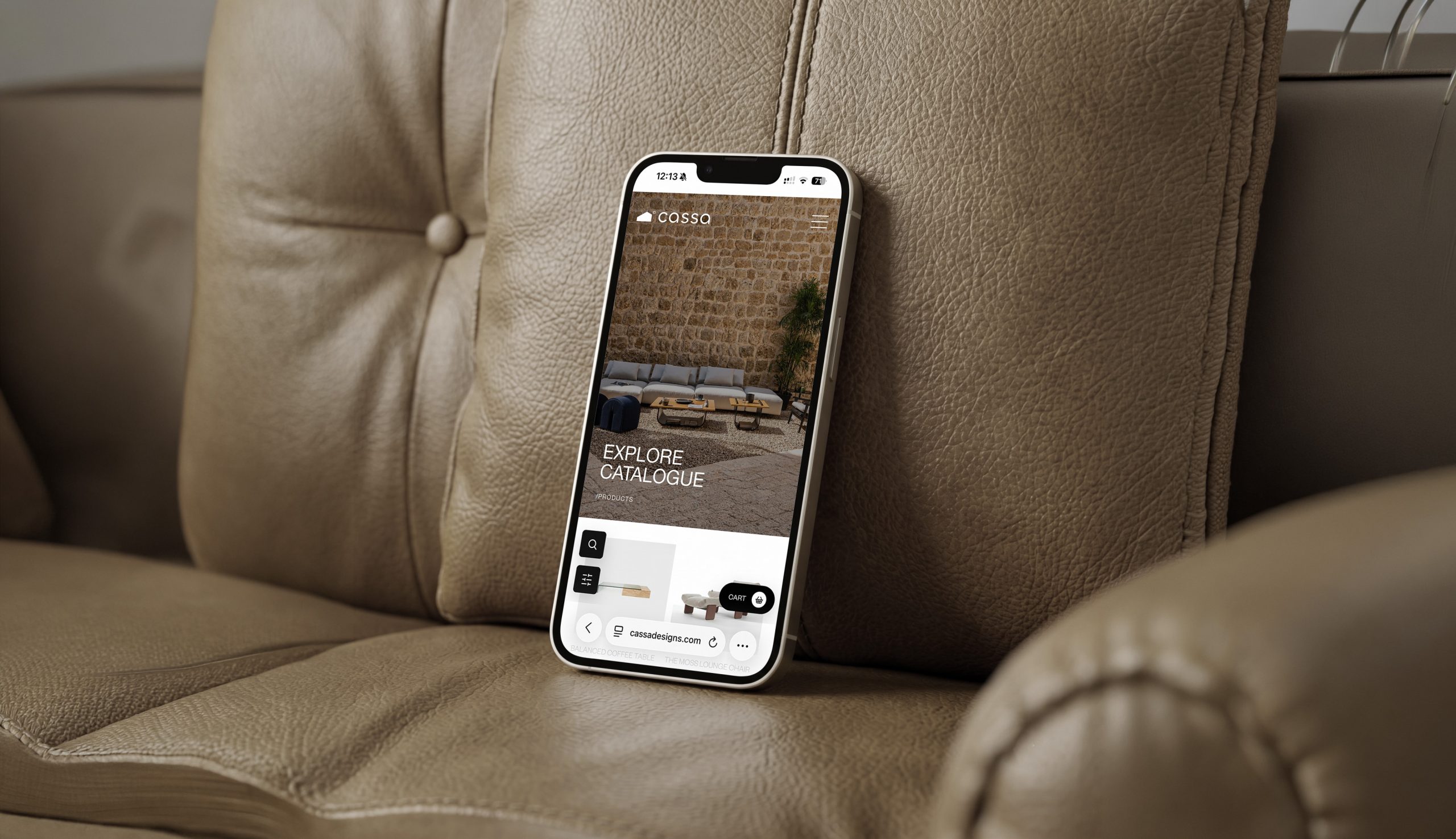
Cassa Designs by MCOM
Cassa Designs moved from a limited Wix setup to a custom ecommerce platform that better reflects its premium identity, supports refined product journeys, and gives the brand room to scale.



Case Study
Cassa Designs moved from a limited Wix setup to a custom ecommerce platform that better reflects its premium identity, supports refined product journeys, and gives the brand room to scale.
Cassa Designs was one of Monarq’s earliest and most defining ecommerce collaborations. The project began with a clear limitation: the brand had a premium retail identity, a strong physical presence, and a refined product offering, but its digital platform was constrained by template logic. The online experience did not have the flexibility, scalability, or expressive control needed to match the business.
Client Context
Cassa Designs operates in luxury retail, where product presentation, trust, and brand atmosphere matter deeply. Customers are not only buying functional items. They are buying taste, comfort, and an environment. That means the website had to do more than process transactions. It had to extend the in-store experience into a digital journey.
The Platform Problem
The previous Wix setup was functional at a basic level, but it created a ceiling. Product structures were limited, filtering could not become truly advanced, and brand expression was restricted by the platform. As Cassa grew, those limitations became more visible. A premium brand needed a system that could adapt to its needs instead of forcing the business to adapt to a template.
Strategic Objective
The objective was to build a long-term ecommerce asset. The site needed to feel refined for customers, practical for internal teams, and flexible enough for future expansion. This meant thinking beyond the visible interface and designing a foundation that could support product growth, campaign logic, advanced filtering, and operational improvements over time.
User Experience Strategy
Luxury ecommerce requires balance. If the experience is too minimal, users may lack confidence. If it is too complex, they may hesitate. Monarq designed the journey to reduce friction while preserving a premium feel. Product discovery is clear, categories are structured, and decision points are broken into manageable steps.
Brand Translation
The digital experience needed to carry the same sense of care that customers expect from the brand offline. That meant avoiding a generic shop layout and building a rhythm that feels curated. Product imagery, page spacing, category structure, and microcopy work together to create a calmer shopping environment. The site does not need to shout luxury. It communicates it through control and consistency.
Product Discovery
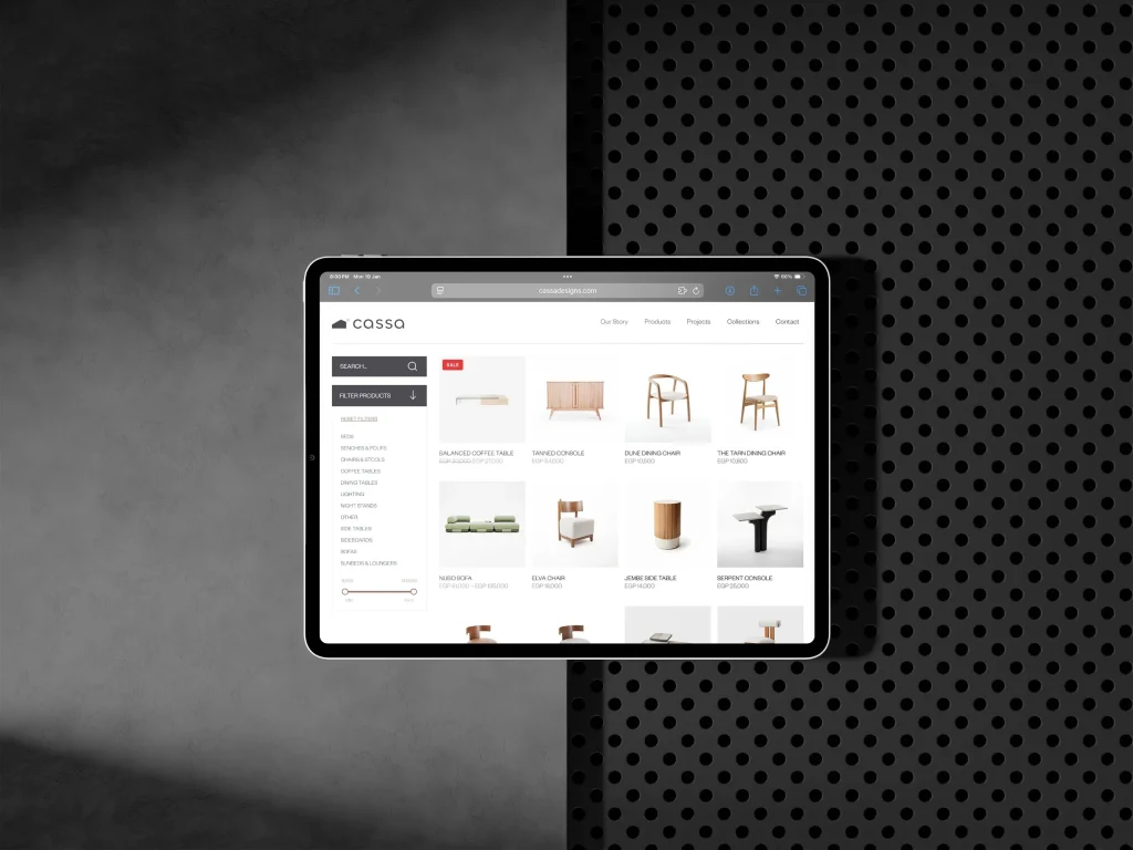
Filtering was treated as a primary experience. Users should be able to narrow products naturally without needing technical knowledge. The custom build supports more flexible product relationships, stronger category logic, and a discovery flow that feels controlled rather than chaotic.
Visual Direction
The interface is intentionally restrained. Luxury is communicated through spacing, rhythm, imagery, and consistency rather than decoration. The design gives products room to lead. Buttons, cards, and layouts are kept clear so the shopping experience feels elegant and reliable.
Product Page Strategy
Product pages were structured to support confidence without crowding the user. The hierarchy gives attention to imagery, essential information, options, and purchase action in a clear order. Supporting details are available without forcing every user through the same dense block of information. This keeps the experience polished while still giving serious shoppers what they need.
Checkout and Conversion
The purchase journey was designed to preserve momentum. Every extra step in checkout creates space for hesitation. The system keeps the path simple, linear, and clear. Cart feedback, product detail hierarchy, and checkout structure all work together to support confidence.
Backend Flexibility
The move away from a template platform gave Cassa more room to operate. Product information can be structured in a way that matches the business instead of the limits of a builder. This matters for collections, variations, campaigns, inventory behavior, and future integrations. A premium ecommerce brand needs a backend that can keep pace with its ambitions.
Scalable Architecture
The move to a custom platform unlocked the ability to grow without rebuilding. New product structures, promotional rules, internal features, and integrations can be added with greater control. This is the core difference between a website that looks good at launch and a platform that continues to support the business.
Mobile Shopping
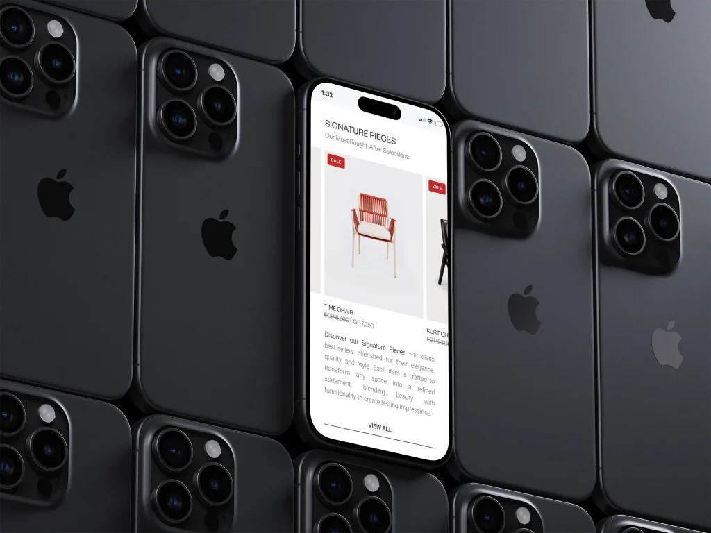
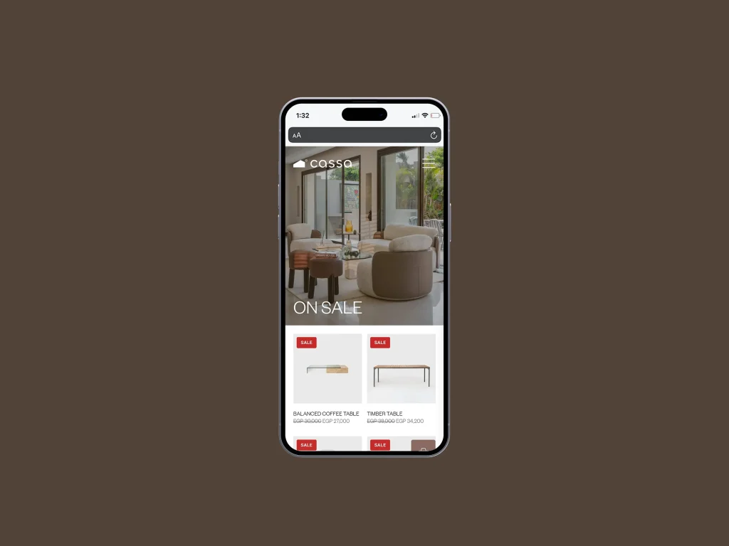
Mobile was especially important because retail discovery often happens in short sessions. The mobile interface needed to make browsing feel effortless, keep product imagery strong, and make purchase actions reachable without making the screen feel crowded. The result is a smaller-screen experience that still feels premium.
Collaboration
The project was built through trust and close collaboration. Cassa brought clarity around brand identity and audience expectations. Monarq brought UX strategy, system thinking, and development architecture. That partnership shaped a platform that was both beautiful and operationally meaningful.
Client and Market Position
Cassa Designs sits in a retail space where the product is tied to taste, identity, and lifestyle. Customers are not only asking whether an item is available. They are asking whether the brand understands their home, their standards, and the feeling they want to create. The website had to make the client feel premium without making the journey feel distant or difficult.
Customer Psychology
Luxury retail users browse differently from necessity shoppers. They need inspiration before action. They want to feel that the products are curated, that the brand has taste, and that the purchase will align with the lifestyle they are building. The experience supports that psychology by slowing the visual rhythm, giving products space, and making discovery feel intentional rather than transactional.
Confidence and Decision-Making
High-end ecommerce has to remove doubt quietly. Product pages, filters, imagery, and checkout all need to answer practical questions without breaking the premium mood. The user should not feel abandoned with too little information, but they also should not feel crowded by operational detail. The design holds both needs together.
Business Perspective
For Cassa, the platform was not just about looking better online. It was about escaping the limitations of a template-based setup and giving the business more control over growth. The site supports brand expression, product expansion, campaign flexibility, and a more serious ecommerce future.
Competitive Context
Cassa competes in a space where many stores can sell similar categories, but not every store can create the same sense of taste. The website needed to make the brand feel curated and intentional. That distinction matters because premium retail customers often choose the brand that makes selection feel easier and more refined.
Content and SEO Thinking
Category structure, collection language, and product hierarchy all support discovery. The platform gives the brand a better base for search visibility while keeping the browsing experience elegant. SEO value is built through structure, not through adding heavy copy that would weaken the retail mood.
Performance and Product Focus
For a visual retail brand, performance directly affects perception. Slow galleries or unstable product layouts can make the experience feel less premium. The design keeps product imagery central while preserving a stable, responsive interface across devices.
Measurement and Merchandising
The platform can help the client understand how customers browse, which categories attract attention, where users drop off, and which collections deserve stronger promotion. That makes the website useful as a merchandising and learning tool, not only a storefront.
Outcome
Cassa Designs gained a platform that better reflects its premium position and removes the restrictions of its previous setup. For Monarq, the project became an important proof point: custom ecommerce is not excess when a business needs control, scalability, and a user experience shaped around real behavior.